Reviving the Legacy of Spice Through Modern Branding
BRAND NAMING
BRAND IDENTITY
BRAND STRATEGY
COMMUNICATION STRATEGY
PACKAGING
The Challenge
The Silk Road was once the great passageway of trade, carrying spices so prized they were valued more than gold. Inspired by this timeless journey, our client envisioned a brand that could bring the same authenticity into today’s homes with freshly ground spices.
They came to us to build the brand from the ground up — naming, logo, and packaging — with a focus on preserving that sense of heritage while keeping it simple, honest, and relevant for modern kitchens.


The Silk Road : The Making Of
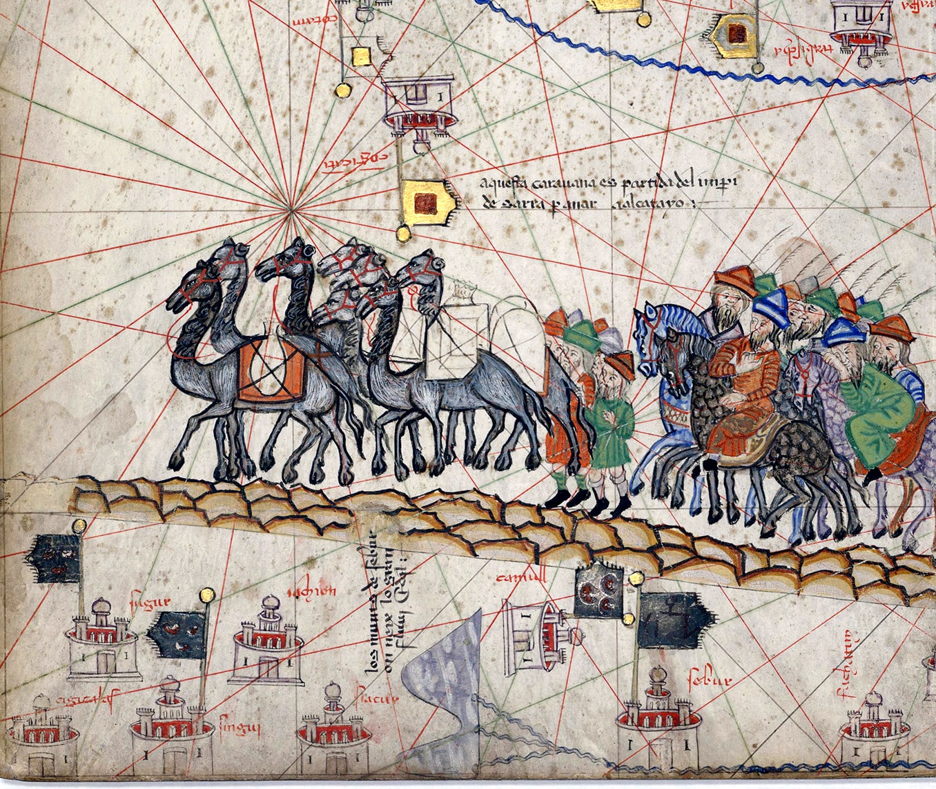
The Silk Road logo draws from the landscapes that once shaped the ancient spice trade. The mountains and rivers symbolize both nature’s abundance and the routes the early traders traveled to bring spices to India. Together, they represent a journey, from source to kitchen. Reminding us that every pack carries not just flavor, but a legacy of movement, culture, and connection.

For the packaging, we embraced earthy, ingredient-led colors — each spice pack reflecting the vibrance of what’s inside. The bold typography puts the spice name front and center, ensuring clarity on a busy shelf, while small illustrative details add character and authenticity.
- Brand Discovery
- Brand Story
- Logo Design

The Result
A cohesive identity that connects the timeless story of the spice trade to today’s modern kitchens — fresh, honest, and instantly recognizable.